


Session Overview (Example Layout)
A simple “everyday layout” example that gives you the key info you need in Practice, Quali, and Race without clutter. [1]
Goal
What this layout gives you
- Time & session awareness (time left / session state).
- Flags & warnings you can’t miss.
- Weather / conditions for strategy calls.
- Traffic awareness for safer battles and rejoins.
What it avoids
- Big blocks in the middle of the screen.
- Overlapping overlays fighting for attention.
- “Too much data” that you never actually use.
Recommended overlay pack (simple & effective)
This is an example pack — you can swap items in/out depending on the sim and your preference.


Build it in 5 minutes
- Create a new layout (name it something like “Session Overview”).
- Enable these overlays: Session Timer, Digi Flag, Weather KMonitor, Relative, Radar, Fuel Calculator.
- Place them roughly using the “Where to place things” guide below.
- Drive one lap, then do a quick resize & tidy so nothing blocks braking markers.
- When it looks right, copy the layout across session types (Practice → Quali → Race) using “Copy All / Paste All”.
Where to place things (works for most people)
Top corners (strategy + rules)
- Top-left: Digi Flag (easy to notice, low distraction).
- Top-right: Weather KMonitor (quick glance on straights).
- Top-centre: Session Timer (only if it doesn’t block track view).
Lower area (awareness)
- Lower-left: Radar (peripheral awareness).
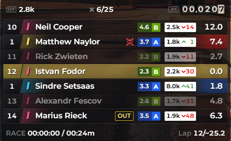
- Lower-centre or lower-right: Relative (traffic + pit awareness).
- Lower-right: Fuel Calculator (strategy, not constant viewing).
Rule: anything you need “instantly” goes higher (flags/time). Anything you check “sometimes” goes lower (fuel/weather/relative).
Adjust by session type (quick changes)
Practice
- Keep Weather + Fuel visible while you’re learning consumption.
- Radar/Relative optional unless you’re in traffic.
Qualifying
- Make it cleaner: consider hiding Radar (less needed on clear laps).
- Keep Session Timer + Flags visible.
Race
- Keep Radar + Relative (highest value during battles & traffic).
- Fuel + Weather stay smaller (glance-only).
Endurance
- Increase the importance of Fuel + Weather.
- Consider adding Standings or a small Lap Timing panel if you use them.
Troubleshooting
Layout feels cluttered
- Shrink Weather + Fuel first (they are “glance” items).
- Reduce rows in Relative.
- Move Radar further into the corner and lower its size slightly.
Overlays block the track
- Move anything from the centre to corners.
- Use transparency for the “always-on” items (timer/flags).
- Keep the middle of the screen clean at all costs.
Sources & References
[1] Example “Session Overview” layout concept for this support site.
↩ back
[2] Session Timer Overlay image (provided).
↩ back
[3] Digi Flag Overlay image (provided).
↩ back
[4] Weather KMonitor Overlay image (provided).
↩ back
[5] Relative Overlay image (provided). ↩ back
[6] Radar Overlay image (provided). ↩ back
[7] Fuel Calculator Overlay image (provided). ↩ back
[5] Relative Overlay image (provided). ↩ back
[6] Radar Overlay image (provided). ↩ back
[7] Fuel Calculator Overlay image (provided). ↩ back